


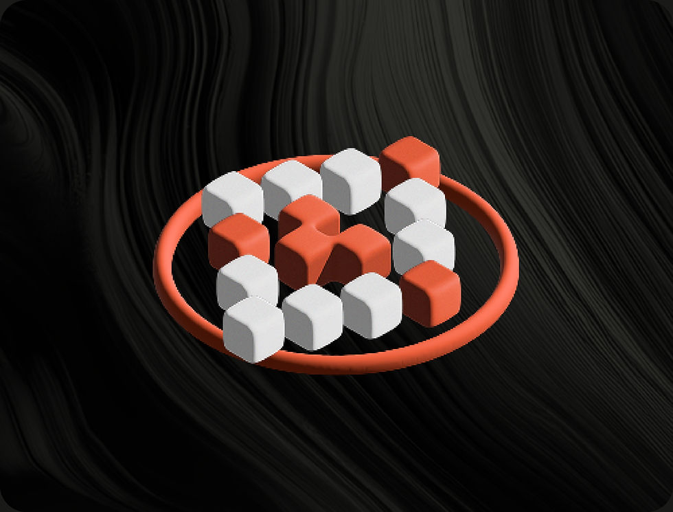
Design Direction
The TAU Protocol design adopts a futuristic and immersive direction that reflects its position in the DeFi and blockchain space. The visual style combines dark, fluid backgrounds with geometric 3D forms to evoke depth and sophistication. Warm orange gradients contrast against sleek black surfaces, highlighting key content and guiding user attention. Typography is bold and modern, using strong sans-serif fonts to enhance clarity and impact.
The layout maintains a structured hierarchy, balancing technical precision with visual dynamism. Overall, the design communicates innovation, trust, and cutting-edge technology, aligning perfectly with TAU’s identity as a next-generation perpetuals DEX.


2024
TAU Protocol: Web App
TAU Protocol is a decentralized perpetual derivatives exchange built on the Optimism Superchain, offering high-speed, low-cost trading with up to 50X leverage. Designed with an isolated market structure and powered by Chainlink oracles, it ensures transparency, precision, and reduced systemic risk for traders and liquidity providers.
The project involved designing the user interface and website, focusing on creating a professional and futuristic visual language that reflects TAU’s position at the forefront of DeFi innovation. The final design emphasizes usability, clarity, and trust — aligning with the platform’s mission to redefine on-chain perpetual trading.
UIUX
Deliverables
UI design, Web design, Prototyping
Collaborators
TAU Protocol Developers
Project Duration
1 month
Country
United States

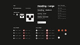
Design Kit
The TAU Protocol design system embodies a bold, modern aesthetic that reflects the precision and innovation of decentralized finance. Built around a clean dark theme accented by vibrant orange gradients, it conveys both authority and energy — aligning with TAU’s position as a next-generation derivatives exchange.
The logo’s geometric form symbolizes balance and stability, while the consistent iconography ensures scalability across platforms and screen sizes. Typography is anchored by the Poppins typeface, chosen for its clarity and modern proportions, establishing a strong visual hierarchy from large, impactful headings to compact body text. A structured icon system with hover states and defined size variations reinforces usability and coherence across interfaces.
Every element — from color contrast to spacing — is designed to enhance legibility, convey trust, and maintain visual consistency across website and dashboard environments, ultimately creating a user experience that feels professional, technical, and intuitively precise.