2019
Case Study: ReadyTravel App
01. Research
02. Definte & Ideate
03. Design
04. Evaluate
01. Research
The research phase for the ReadyTravel App centered on exploring the evolving habits of modern travelers and their relationship with money management while abroad. By studying user behaviors, motivations, and pain points within the peer-to-peer currency exchange landscape, the research aimed to uncover how travelers plan, budget, and manage financial transactions during trips.
Insights gathered from market analysis and user interviews provided a clearer understanding of travelers’ expectations for convenience, trust, and flexibility. These findings guided the development of a more seamless and user-friendly app experience—ensuring the platform not only meets practical financial needs but also enhances users’ confidence and enjoyment throughout their journeys.
1.1 Objective
Define users’ motivations, needs, and frustrations when exchanging currencies physically and while browsing exchange rates online.
Understand industry standards and what features/services provide currency exchange a competitive edge among travelers.
Understand what satisfies and affects a customer’s experience while making an exchange transaction.
Identify areas of improvement ReadyTravel currency exchange process.
1.2 Provisional Personas
To gain a clearer understanding of the target audience and support further exploration of how the platform could resonate with different user segments, three provisional personas were developed. These personas were informed by insights collected from online reviews, traveler communities, and behavioral patterns observed among frequent, budget, and casual travelers. Each persona represents distinct motivations, goals, and challenges related to travel planning and currency exchange, helping to guide design decisions and ensure the ReadyTravel App effectively addresses diverse user needs.


1.3 User Survey
Short online surveys were conducted to gather quantitative data on travelers’ currency exchange habits, travel frequency, and awareness of digital exchange platforms. A total of 15 responses were collected—five from each key segment: the Frequent Traveler, the Business Traveler, and the Family Traveler. Participants ranged in age from 20 to 45, providing a diverse yet focused perspective on how different traveler types manage currency needs while abroad.
Assumptions before the survey:
-
Exchange rates are the most important factor for users looking for an exchange.
-
Users care about the ease of use.
-
Users are aware of currency exchange platforms online.
-
Users will use ReadyTravel because of convenience.
Survey Results
79%
of traveller make their exchange at a physical currency exchange
61%
preferred to check rates online before visiting the store for currency exchange
84%
of travellers consider exchange rates a huge decision factor
36%
of travellers are aware of money exchange platforms online
1.4 Affinity Mapping
Survey responses, participant quotes, and key comments were organized into an affinity map to identify recurring patterns and themes. By clustering similar insights and extracting keywords, this process helped define users’ underlying needs, expectations, and frustrations—laying the groundwork for a clearer understanding of traveler behaviors and priorities.

"...check the rates online before going out to the store."
"...usually exchange my money at the airport so I don't make 2 trips."
From the clustering of responses and analysis of patterns within the survey data, several key insights emerged:
-
Users seek assurance that ReadyTravel offers competitive exchange rates compared to traditional exchange methods.
-
Users value convenience and accessibility, preferring a platform that simplifies the exchange process anytime, anywhere.
-
Users prioritize security and trust, needing confidence that their transactions and personal data are safe.
-
Users desire a simple and intuitive interface, ensuring that ReadyTravel is easy to navigate even for first-time users.
These insights highlight the core expectations that should guide the design and communication strategies for the ReadyTravel App.
1.4 The Ready Traveller
Using qualitative insights gathered during early research and aligning them with key user needs, Maya Lee was developed as the primary persona — representing The Ready Traveller.
Maya, 28, is a journalist who frequently hops between countries for assignments. With a fast-paced schedule and constant deadlines, she has limited time for traditional currency exchanges and often resorts to airport kiosks, where rates are less favourable. Working six days a week and always on the move, Maya values convenience, competitive exchange rates, and secure digital tools that help her manage money effortlessly while travelling.
This persona embodies the ideal ReadyTravel user — young, busy, globally mobile, and highly motivated to find smarter, more efficient travel finance solutions.

1.5 Maya's Journey
A simplified user journey for currency exchange was developed to identify key touchpoints and pain points within the process. This helped the team pinpoint opportunities for improvement and design interventions aimed at creating a smoother, more intuitive, and engaging currency exchange experience for ReadyTravel users.

User Pain Points
Maya often experiences frustration when searching online for nearby currency exchange stores, as rates are either inconsistent or uncompetitive. On days when she visits a shop, she frequently discovers that the desired currency is unavailable, causing delays that take valuable time away from her work.
-
Maya is constantly traveling and needs to exchange currency quickly and efficiently.
-
Exchange rates are uncertain until she arrives at the shop, often leading to disappointment.
-
She needs a reliable and transparent source to track live exchange rates and locate nearby exchange services with confidence.
These challenges highlight the need for a seamless, trustworthy, and time-saving solution like ReadyTravel to simplify the exchange process for busy, on-the-go travelers.
02. Define & Ideate
2.1 Defining problem and solution
A deeper analysis of the insights and user needs was conducted following the primary research to translate findings into actionable problems and potential solutions. This stage aimed to clearly define the design challenge from a human-centered perspective, ensuring that every decision was grounded in real user behavior. By reframing insights into opportunities, the process guided more focused and solution-oriented brainstorming to enhance the overall ReadyTravel experience.
How might we shorten the exchange process so that Maya can get her currency exchanged in the shortest time possible?

Reflecting on the business goals, user goals, and taking technical capabilities of the developer into consideration, a middle ground was created and the solution was defined.

Optimise the currency exchange experience while displaying full features of ReadyTravel.
With the solution defined, the team moved forward to discuss and identify key product features essential for developing the prototype. This step ensured that every feature aligned with user needs and supported the overall goal of creating a seamless and intuitive currency exchange experience.
2.2 Information Architecture
To determine the essential features for the ReadyTravel app, the team revisited the previously defined problem statements and proposed solutions. Through a collaborative brainstorming session, ideas were refined and prioritized based on user needs and technical feasibility. By the end of the session, a comprehensive UI specification document and a high-level feature list were developed to guide the product vision and ensure alignment across design and development teams for prototype execution.


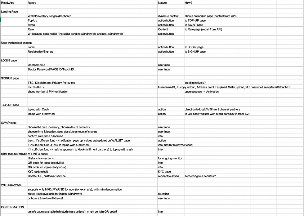

Based on response trends and the finalized feature list, an information architecture was developed to establish a clear and intuitive structure for the app. This ensured that users could navigate seamlessly, with a simplified journey flow that supports effortless access to key functions and enhances the overall usability of ReadyTravel.

03. Design
3.1 From Low Fidelity to Medium Fidelity Wireframes
The wireframing process began with a series of exploratory sketches that visualized ReadyTravel’s core features, identified earlier from the high-level feature list and information architecture. These initial sketches focused on layout variations and content organization, ensuring that both user needs and business objectives were addressed within technically feasible constraints. Establishing this foundational framework allowed subsequent screens and features to be designed with consistency and scalability in mind.
Following this stage, medium-fidelity wireframes were developed to illustrate structure, hierarchy, and interaction flow more clearly. This level of detail differentiated key interface elements such as buttons, text fields, and imagery, enabling stakeholders to better visualize the overall design direction and provide informed feedback prior to high-fidelity prototyping.


3.2 The First Prototype (User-Testing)
The first interactive prototype was developed in Adobe XD, focusing on ReadyTravel’s core features with minimal visual styling and animation. At this stage, the goal was to validate functionality and task flow rather than aesthetics.
A short usability testing session was conducted using the medium-fidelity prototype, where four participants aged 27 to 32 were asked to complete key tasks representative of typical user interactions. The tasks included:
-
Searching for the nearest ReadyKiosk.
-
Performing a currency swap from USD 200 to SGD.
-
Making a USD 100 withdrawal with the delivery option set to “Home.”
The purpose of this testing phase was to assess the clarity and efficiency of the user journey, identify friction points, and gather feedback for further design refinement before moving into high-fidelity prototyping.
View usability test plan here.
User Testing Results
100%
of users are able to complete all 3 tasks assigned
100%
of users completed all 3 tasks without any errors
100%
of users felt that completing the tasks were easy and simple
3.3 High Fidelity Design
With positive feedback gathered from the usability tests, the next phase focused on integrating ReadyTravel’s branding and visual identity into the app. This stage translated functional wireframes into a polished interface that reflected the company’s personality and tone. Iconography, color palette, and button styles were refined to align with industry standards and user expectations, drawing reference from Material Design principles to ensure consistency, accessibility, and familiarity. The result was a cohesive visual system that strengthened brand recognition while maintaining a clean and intuitive user experience.

3.4 Modular Design
A modular design system was implemented to streamline the ReadyTravel app’s development process and ensure visual and functional consistency across all screens. This system enabled efficient design-to-development handoff by allowing the reuse of standardized components and their various states—such as cards, list items, and interactive controls.
Each component was designed to be flexible and easily adaptable, allowing them to be combined or rearranged without compromising the overall coherence of the interface. This approach not only improved scalability and efficiency but also reinforced a recognizable and consistent user experience throughout the app.

3.5 Final Prototype
After several rounds of iteration with stakeholders and close collaboration with developers, the final high-fidelity prototype was completed and prepared for handover. The design incorporated feedback from usability testing and technical discussions, ensuring that the final product was both visually refined and development-ready.
WHAT YOU NEED IS TRAVEL READY
Travel should be simple. Manage your FX needs on the ReadyTravel app anytime anywhere.
-
14 Currencies
-
Peer-to-Peer Swapping
-
FX are validated in the network
Onboarding
Upon registering for an account, users are guided through a brief onboarding process that introduces ReadyTravel’s key features and functionalities. This helps first-time users quickly understand the app’s value, navigation flow, and how to make the most of its core services.
Dashboard
After onboarding, users land on the main dashboard, which provides a clear overview of their wallet balances across different currencies. Designed for efficiency and clarity, the dashboard serves as the central hub for key actions such as swapping currencies, topping up the wallet, and withdrawing funds. This layout ensures users can manage their finances seamlessly within a single, intuitive interface.

Top Up
Users can top up their wallets in their preferred currency using multiple payment methods, including cash, credit card, or Faster Payment System (FPS) in Hong Kong. This flexibility ensures a convenient and seamless funding experience tailored to users’ preferences and regional payment habits.

04. Evaluate
While the results from the initial usability testing were largely positive, the app design was still considered a work in progress and required further refinement through additional iterations.
Following the handoff of the final prototype for development, the team at Pecutus decided to move forward with the app launch using the current design. Concurrently, they continued conducting user acceptance testing (UAT) and iterative improvements to enhance performance, usability, and overall user experience post-launch. This agile approach ensured that user feedback remained central to ReadyTravel’s ongoing development and optimization.